Excel is a powerful tool for handling data, but raw spreadsheets can often look dull and overwhelming. Luckily, a few simple formatting tricks can completely transform your data, making it more visually appealing and easier to interpret.
1 Hide Excel Gridlines
Microsoft Excel displays a series of faint lines between cells, i.e. gridlines, by default. While gridlines can help you navigate the spreadsheet, they can also make your data look cluttered and less presentable. You can hide the gridlines to get a polished clean look.
To do this, simply navigate to the View tab, and under the Show group, uncheck the Gridlines box. Your data will immediately appear cleaner, making charts, tables, and formatted cells stand out. If needed, you can add borders to specific cells or ranges to highlight critical data.
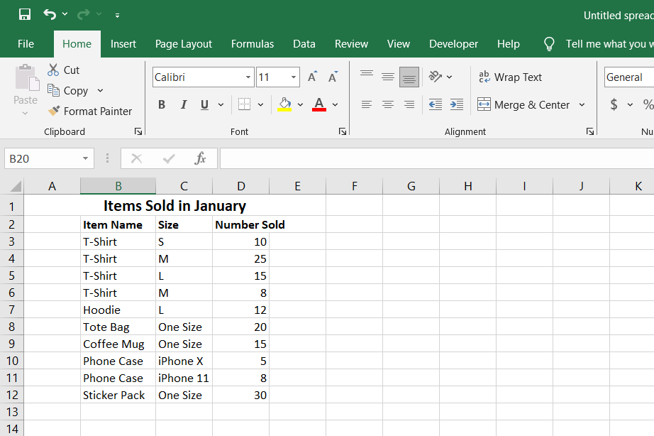
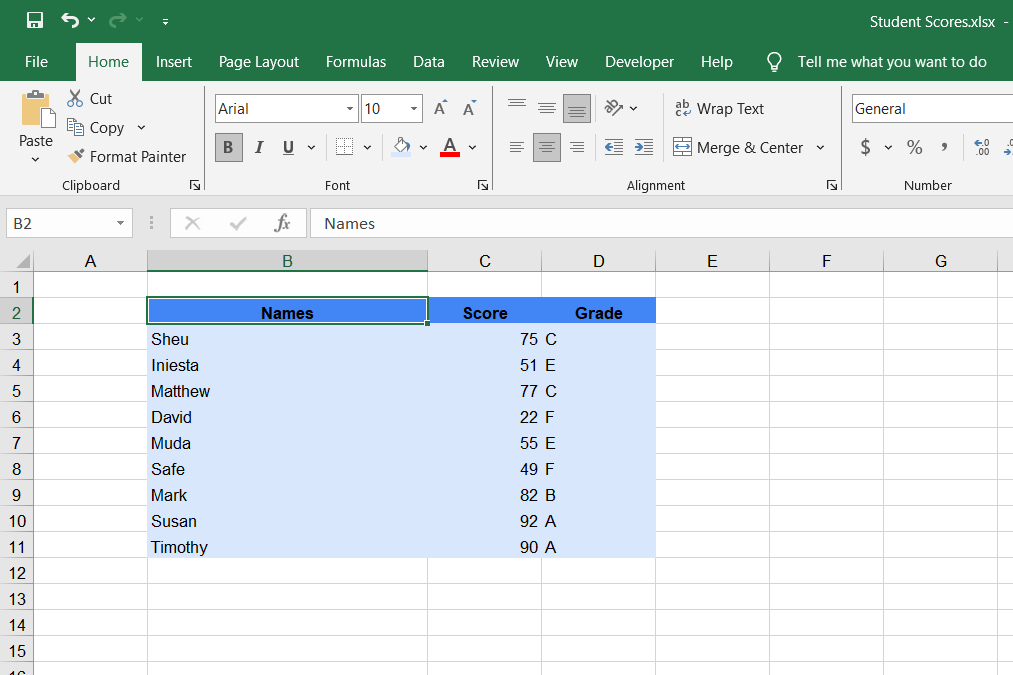
I also like to create a big, bold header at the top of the spreadsheet for the title. This header spans multiple cells and describes the purpose of the spreadsheet in a few words.
To create such a header, navigate to the top of the Excel spreadsheet and insert an empty row (Right-click, then select Insert, and Entire Row) if you already have content in the top row. Next, select A1 and type the title of the spreadsheet, then select the range of cells to contain the spreadsheet title. Finally, navigate to the Home tab, click Merge & Center, and all the selected cells will be combined with your title at the center.
To make the title stand out even further, increase the font size, use bold formatting (
Ctrl + B
), and choose a distinctive color that complements your data.
3 Format Your Data as Table
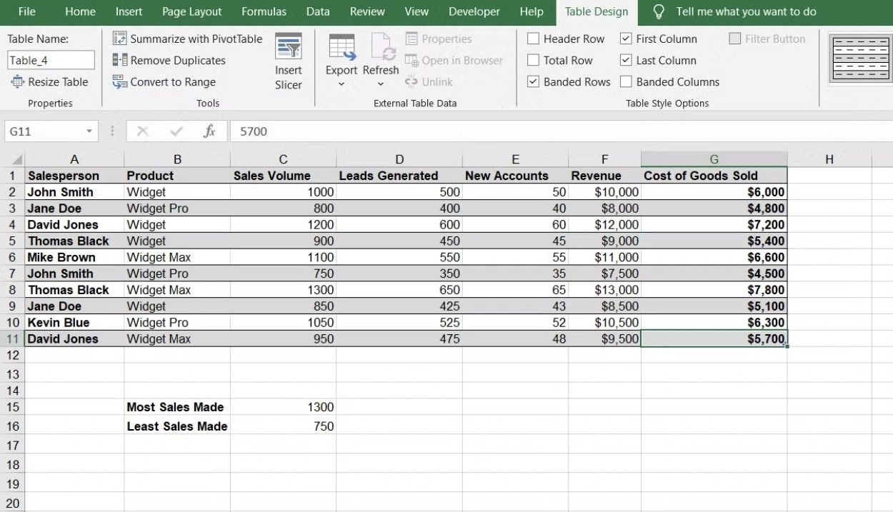
I like to format large datasets in Excel as tables. Excel tables appear less cumbersome and are easier to manage. Though table styling can appear generic, it is a useful trick that can be used to level up your Excel data presentation chops.
To format your data as a table in Excel, select the range of cells you want, go to the Home tab, select Format as Table from the Styles section, and choose the Table Style you prefer from the light, medium, and dark options.
If you are put off by the default options, you can create a new style by going to New Table Style and customizing the colors, borders, and fonts to match your preferences.
4 Leave Space Between the Data and the Headings
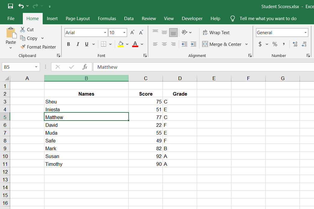
Formatting doesn’t have to be complicated to make a difference. It can be as simple as leaving a bit of space between your data set and the spreadsheet’s row and column headings. When your data is crammed right up against the headings, it can look cluttered and harder to interpret at a glance.
To create this visual separation, you can insert a blank row and column before your data starts. This can be especially helpful when presenting large datasets, as it prevents the information from feeling too dense.
5 Keep Text Wrapped Within Their Cells
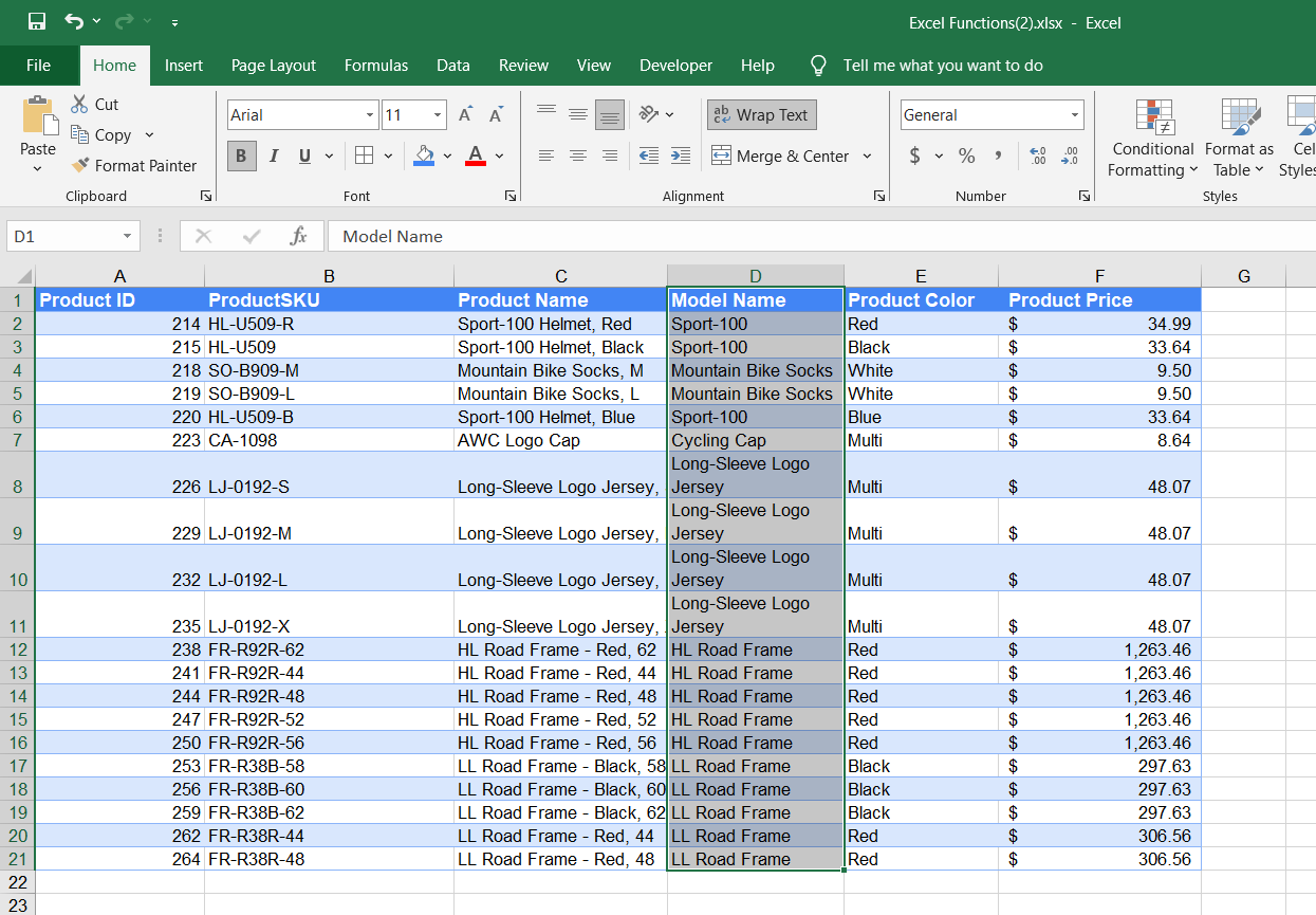
When dealing with data that contains lengthy labels or descriptions, you can use text wrapping to preserve the column width and make the text easier to read. By default, Excel allows text to overflow to adjacent empty columns or truncates characters if the next column contains data.
You can enable text wrapping by selecting the cell or group of cells with lengthy text strings, then navigating to the Home tab, and clicking Wrap Text. Text wrapping ensures that lengthy text remains within the cell, automatically wrapping onto the next line without altering the column width.
6 Use Contrast to Make Text Easier to Read
It never hurts to keep basic graphic design principles in mind when styling your Excel spreadsheet. The contrast between the text color and the background color makes your spreadsheet easier to read.
Excel uses a high contrast combination for the text and background, by default. You can change text color using the Font Color option and choose a different background color from the Fill Color menu. Excel will show a text preview and tell you if the color combination is high or low contrast. You can also check the box at the top to show high-contrast colors only.
7 Use Special Formatting for Formulas
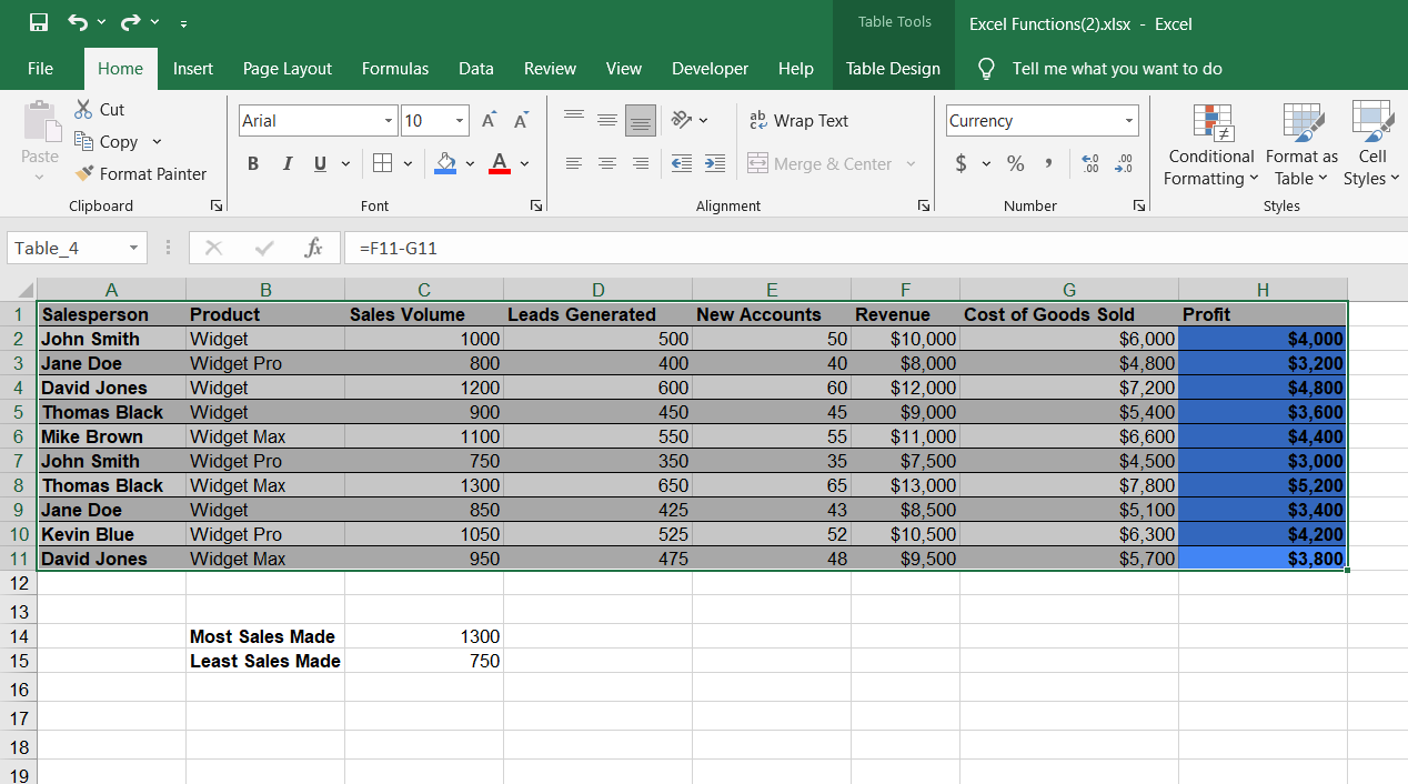
Another formatting trick I have found helpful is using special formatting for cells that have formulas. This makes it easier to distinguish between regular, inputted data and calculated results in complex spreadsheets.
To format formula cells, select the cells that contain formulas and highlight them using a unique background color from the Fill Color menu or bold (Ctrl+B).
Excel allows you to automatically locate all formula cells by pressing
Ctrl + G
, selecting
Special
, and choosing
Formulas
.
Applying this formatting trick helps you and others quickly identify where calculations are happening, making it easier to audit the spreadsheet for errors. This trick is especially valuable when sharing workbooks with colleagues or clients.
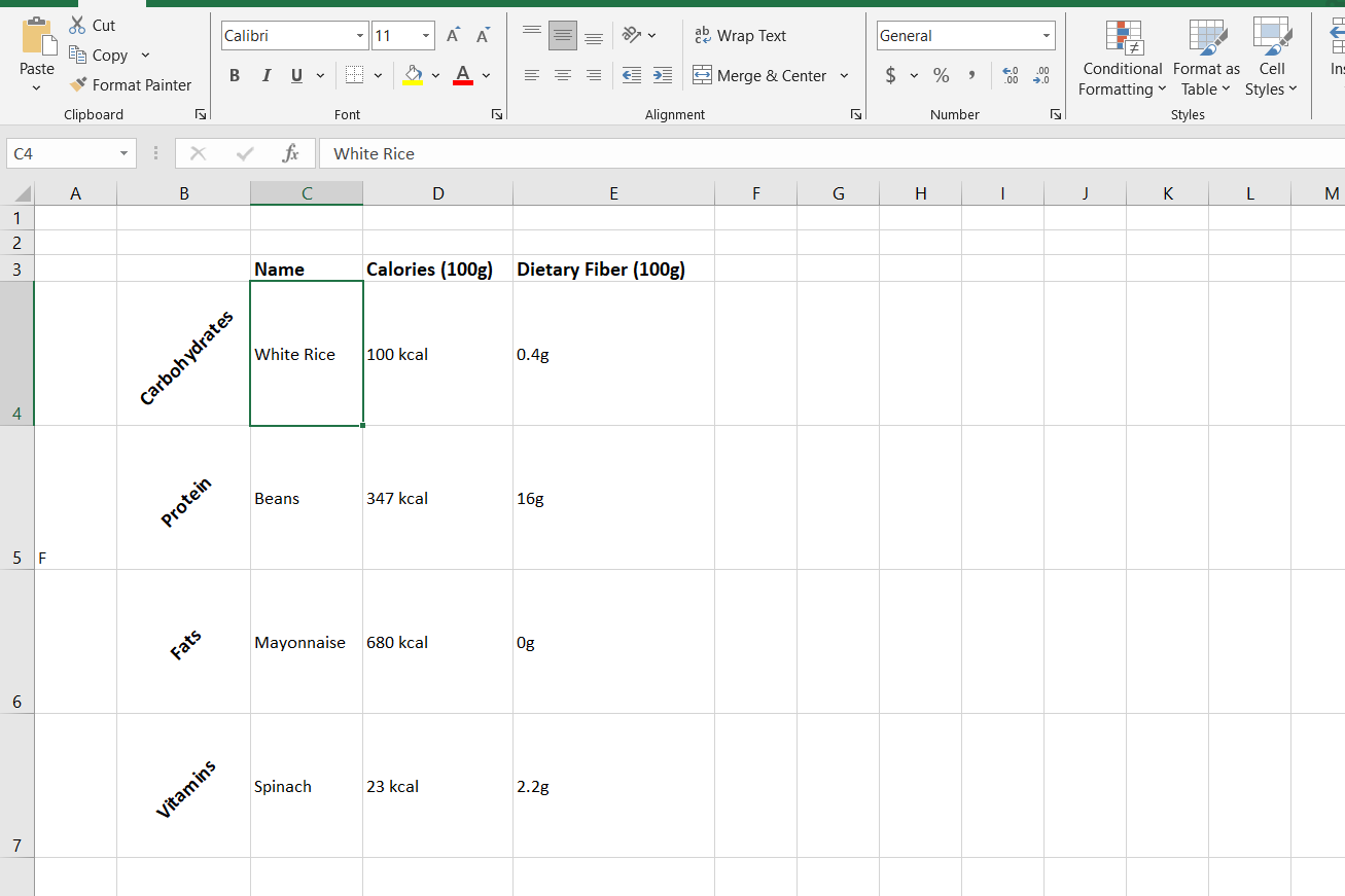
Vertical headers are a lesser-known formatting trick for organizing spreadsheet data in a more efficient and compact layout. These headers can conserve space and make your spreadsheet easier to read. You can either turn your column headings into vertical text or create row headings with vertical orientation.
To use vertical headers, select the cells containing your headers, go to the Home tab, click on the Orientation icon, and choose Vertical Text. However, Vertical Text adds spacing to the letters, which might push the text beyond the boundaries of the cell. You can correct this by going to the Home tab, choosing Format, and AutoFit Row Height. Instead of Vertical Text, you can also pick any of the Angle or Rotate options in the Orientation menu.
This trick works particularly well for tables with narrow columns and when you’re trying to fit everything on a single page without text wrapping.
9 Use the Format Painter
The Format Painter comes in very handy when you need to reuse the same formatting—color, font style or font size—across different cells. It is one of those extremely easy-to-use features that will save you time in Microsoft Excel.
The Format Painter is essentially copying and pasting for formatting. You can find it under the Home tab in the Clipboard section. Select the text with the formatting to be copied, click Format Painter, and select the cell, group of cells, or row/column to apply the formatting to. Done!
Alternatively, you can use the shortcuts
Alt
+
Ctrl
+
C
and
Alt
+
Ctrl
+
V
to copy and paste formatting.
Formatting makes the difference between a bland, cookie-cutter spreadsheet and one that is bold, clear, and professional. While aesthetics is important, clarity of communication is the main reason why you should be careful with your Excel spreadsheet’s formatting.

